The color of kitchen cabinets does more to define a kitchen’s overall mood than almost any other single design choice. A shift from stark white to a warm sage or deep navy can completely transform how a space feels, from clinical to cozy, or from plain to luxurious. Cabinet color sets the tone for everything else in the room, including countertops, hardware, and lighting choices.
This list covers ten cabinet color ideas, ranging from timeless neutrals to bolder, more dramatic options. Each idea focuses on how the color pairs with materials, lighting, and overall kitchen style to create a cohesive look. Whether you’re planning a full renovation or simply repainting existing cabinets, these ideas offer inspiration for nearly any taste. Let’s explore how the right color can elevate your kitchen entirely.
1. Warm White for Timeless Brightness
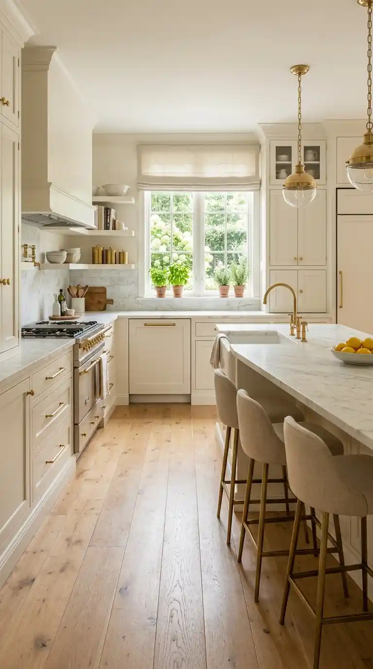
Warm white remains one of the most popular cabinet colors because it brightens a kitchen while still feeling soft and inviting rather than stark. Unlike cooler, blue-toned whites, warm whites carry a subtle cream undertone that pairs beautifully with natural wood floors and brass hardware. This color choice also makes a kitchen feel larger, reflecting light throughout the room.
Choosing a warm white with a matte or satin finish keeps the look soft rather than clinical. Pairing it with a contrasting island color, like a deep green or navy, adds visual interest without losing the brightness. This versatile color works across nearly every kitchen style, from farmhouse to modern minimalist. Warm white cabinets remain a safe yet genuinely beautiful choice for almost any home.
2. Sage Green for Earthy Calm
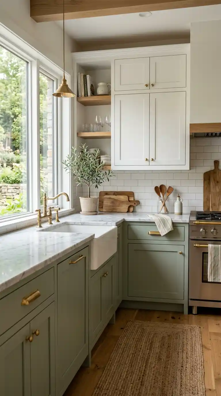
Sage green has become a favorite for kitchen cabinets thanks to its calming, nature-inspired tone that feels both fresh and grounded. This muted shade pairs beautifully with brass hardware, light wood accents, and white marble countertops. Unlike brighter greens, sage feels sophisticated and easy to live with long-term.
Choosing sage for lower cabinets while keeping uppers in white or cream creates a balanced, two-tone look that feels intentional. This color works particularly well in kitchens with lots of natural light, where its earthy undertones can fully shine. Pairing sage cabinetry with terracotta or woven accents reinforces the organic, calming mood. This shade continues to grow in popularity for its timeless yet fresh appeal.
3. Deep Navy for Dramatic Elegance
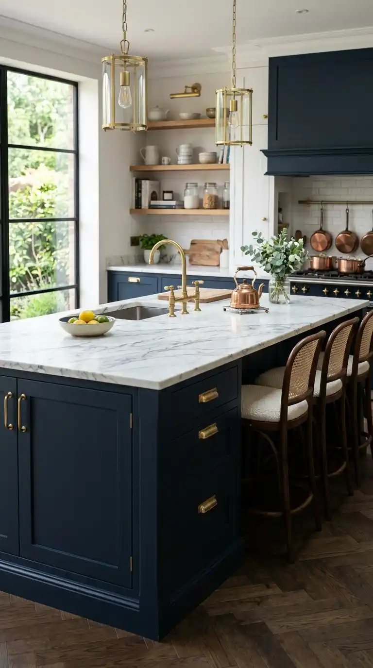
Navy cabinets bring a rich, dramatic depth to a kitchen, especially when paired with brass or gold hardware for contrast. This deep, sophisticated color works beautifully on a kitchen island, creating a striking focal point against lighter surrounding cabinetry. Navy also pairs exceptionally well with white marble or quartz countertops.
Choosing a matte navy finish keeps the color feeling refined rather than heavy or glossy. Pairing navy lower cabinets with white upper cabinets balances the drama with brightness, preventing the kitchen from feeling too dark. Adding warm wood open shelving nearby softens the boldness of the navy tone. This color choice consistently photographs beautifully and remains a favorite for statement kitchens.
4. Soft Greige for Versatile Warmth
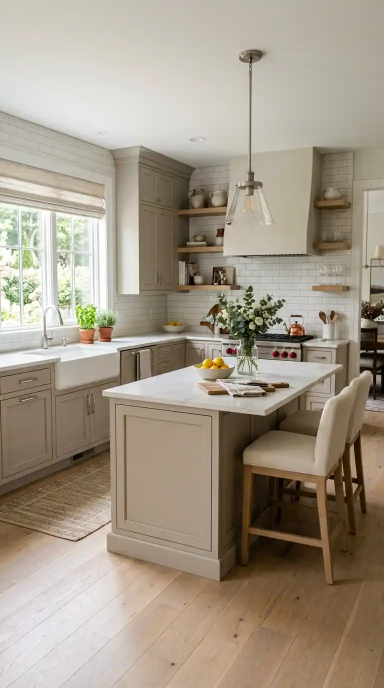
Greige, a blend of gray and beige, offers a warm, adaptable neutral that works well in nearly any kitchen style. This color avoids the coolness sometimes associated with pure gray while still feeling more sophisticated than a standard beige. Greige cabinets pair effortlessly with both warm and cool-toned countertops and hardware.
Choosing a greige with warm undertones keeps the color feeling cozy rather than washed out. This versatile shade transitions well between design trends, making it a practical choice for homeowners who don’t want to repaint frequently. Pairing greige cabinetry with brushed nickel or matte black hardware both work equally well. This adaptable color remains a reliable choice for long-term kitchen design.
5. Charcoal Black for Bold Sophistication
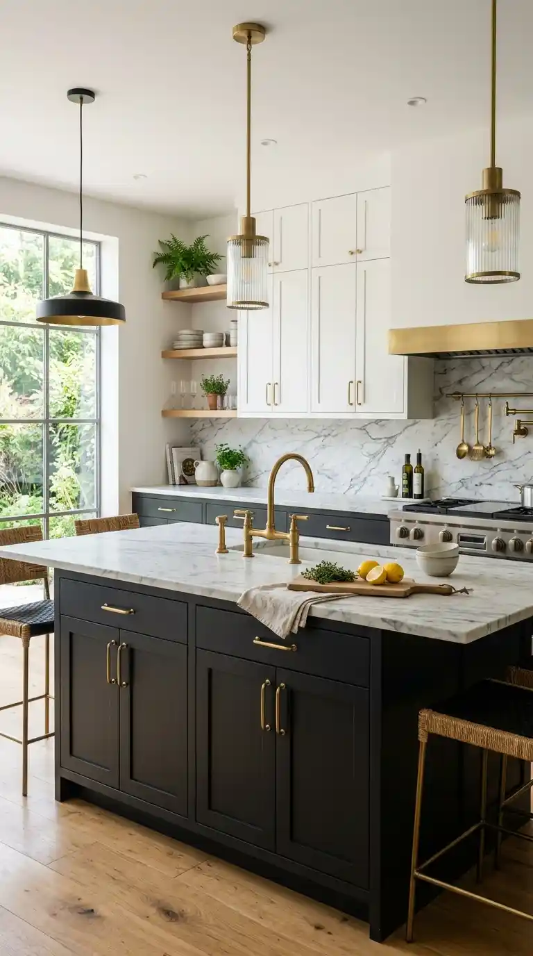
Charcoal or matte black cabinets create a bold, sophisticated statement that works surprisingly well even in smaller kitchens when balanced with enough light. This dramatic color pairs beautifully with brass or gold fixtures, creating a refined, almost moody atmosphere. Charcoal also hides fingerprints and smudges better than glossy black finishes.
Choosing charcoal for lower cabinets while keeping uppers lighter prevents the kitchen from feeling too enclosed or heavy. Pairing this color with light countertops, like white marble or pale quartz, creates striking contrast that keeps the space feeling balanced. Open shelving in warm wood breaks up the darkness with natural texture. This bold color choice consistently creates a high-end, statement-making kitchen.
6. Terracotta for Warm Character
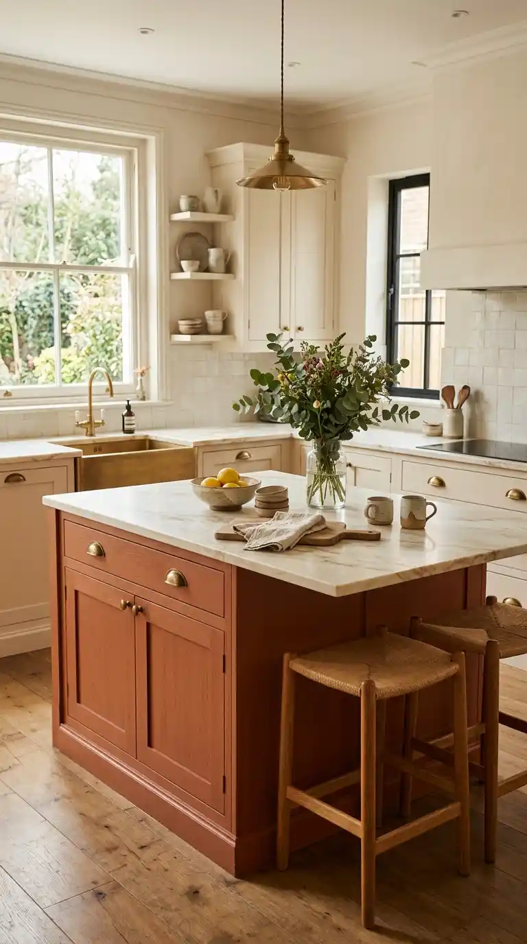
Terracotta and warm rust-toned cabinets bring an earthy, sun-baked warmth that feels both grounded and distinctive. This less common color choice works especially well in kitchens aiming for a Mediterranean or boho-inspired feel. Terracotta pairs beautifully with brass hardware and natural wood accents.
Choosing this color for an island or a single wall of cabinetry, rather than the whole kitchen, keeps the look intentional rather than overwhelming. Pairing terracotta with cream or white surrounding cabinets balances the warmth with brightness. Adding woven baskets or ceramic accents nearby reinforces the earthy, organic theme. This distinctive color choice brings genuine character to a kitchen that wants to stand out.
7. Soft Blue-Gray for Coastal Calm
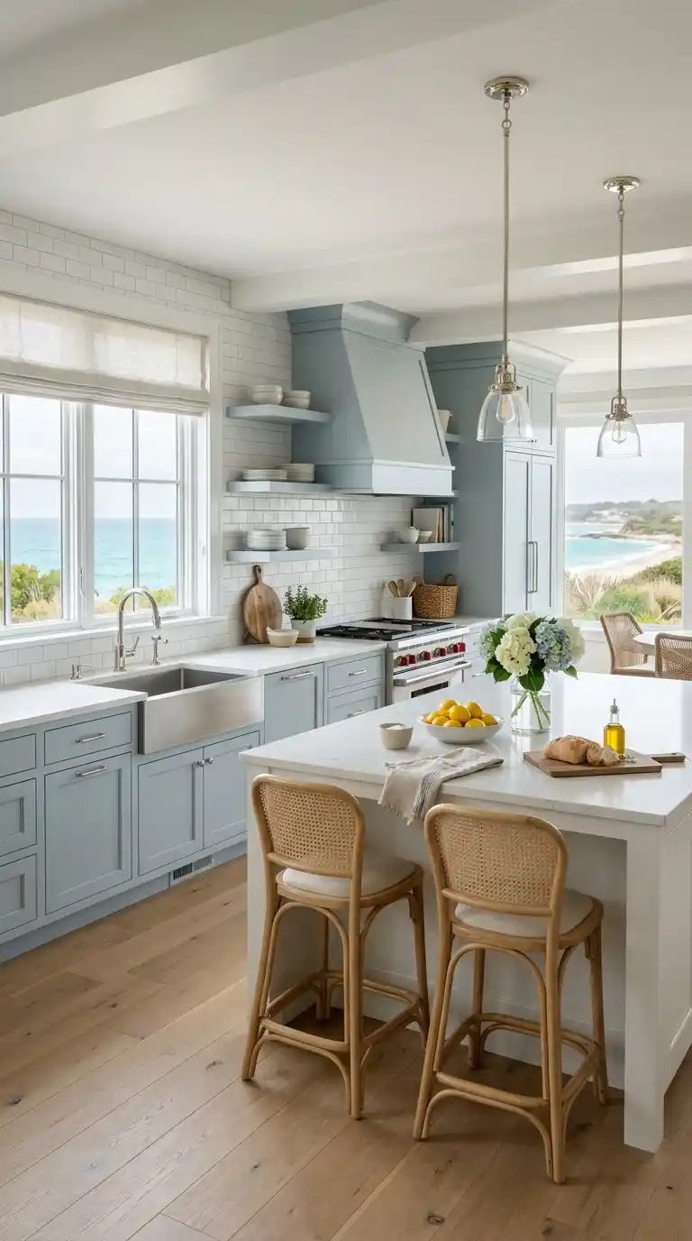
Soft blue-gray cabinets bring a calming, coastal-inspired feel without veering into overly saturated or bright blue territory. This muted tone pairs beautifully with white countertops, brass or nickel hardware, and natural wood flooring. The color feels fresh and clean while still maintaining warmth and depth.
Choosing a matte finish for this color keeps the look soft and sophisticated rather than glossy or cold. Pairing blue-gray cabinetry with white subway tile backsplash creates a timeless, classic combination. This shade works particularly well in kitchens with abundant natural light, where its subtle undertones can shift throughout the day. Soft blue-gray remains a popular choice for kitchens wanting calm without going fully neutral.
8. Two-Tone Cabinets for Visual Interest
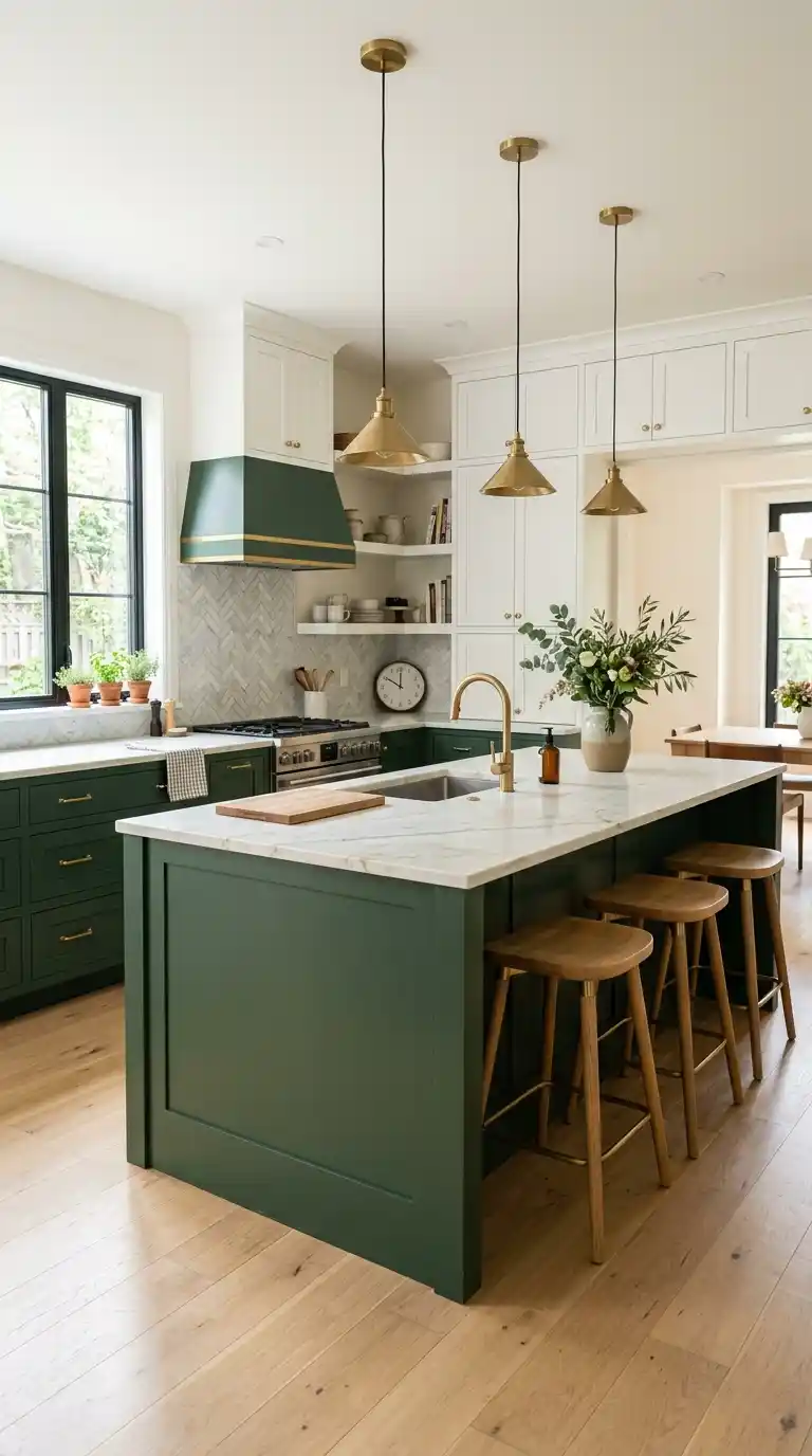
Pairing two different cabinet colors, like white uppers with a colored island or lower cabinets, adds visual interest without committing to a single bold color throughout. This approach allows homeowners to experiment with a statement color, like forest green or navy, in a smaller, more contained way. Two-tone kitchens consistently rank among the most photographed kitchen styles.
Choosing colors with enough contrast, like a deep color against a light neutral, creates clear visual definition between the two tones. Keeping countertops and backsplash neutral allows the two cabinet colors to remain the room’s clear focal point. This flexible approach also makes future updates easier, since only one portion of the kitchen needs repainting if styles change. Two-tone cabinetry offers boldness with built-in balance.
9. Warm Taupe for Subtle Richness
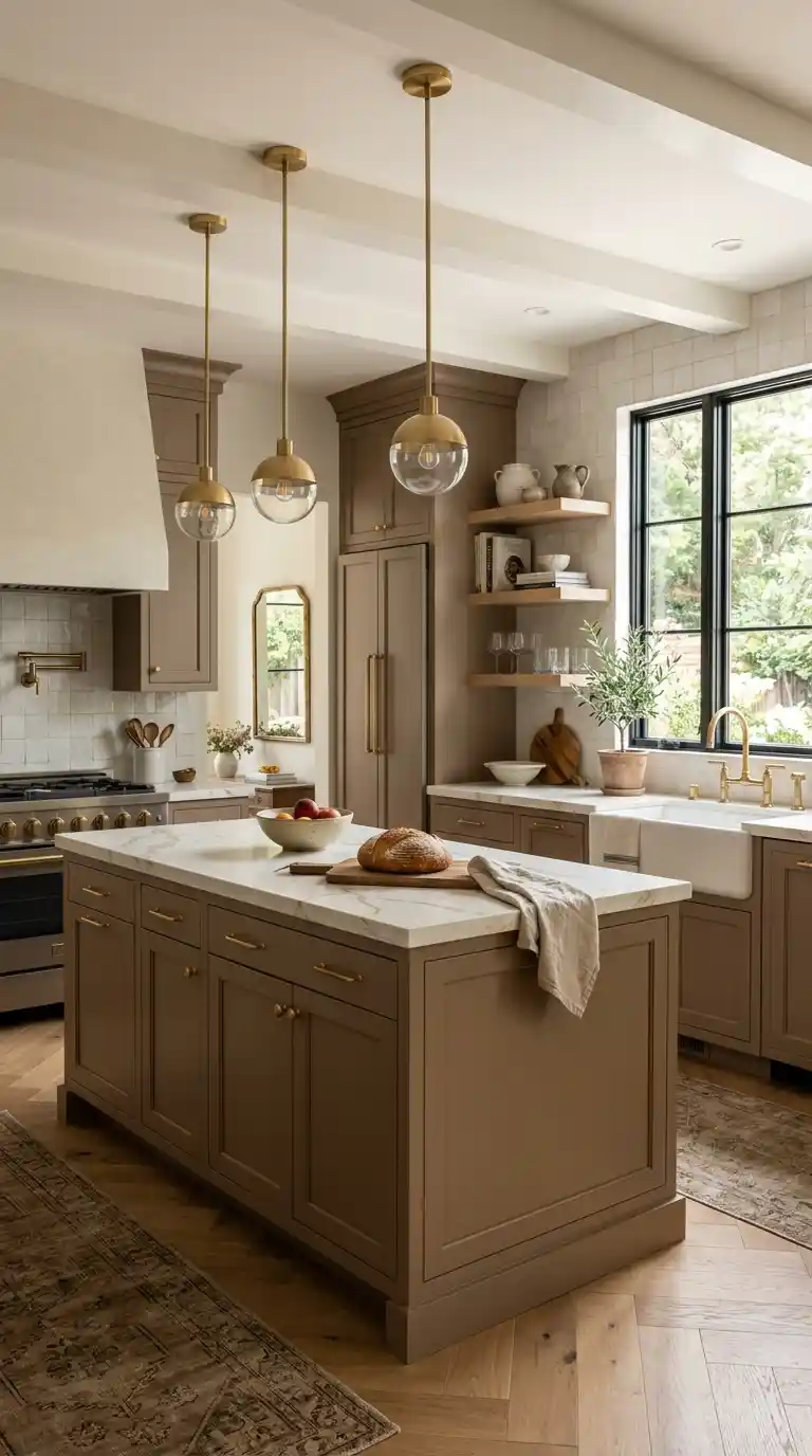
Warm taupe cabinets offer a richer alternative to standard beige, adding subtle depth without veering into bold or trendy territory. This understated color pairs beautifully with brass, matte black, or brushed gold hardware, depending on the desired mood. Taupe also complements both warm and cool countertop choices with ease.
Choosing a taupe with slight warm undertones keeps the color feeling cozy rather than flat or gray. This shade works particularly well in kitchens aiming for a transitional style, bridging traditional and modern elements. Pairing taupe cabinetry with light wood open shelving adds natural texture alongside the color. This subtle, sophisticated choice remains a quietly popular option for timeless kitchens.
10. Forest Green for Rich Depth
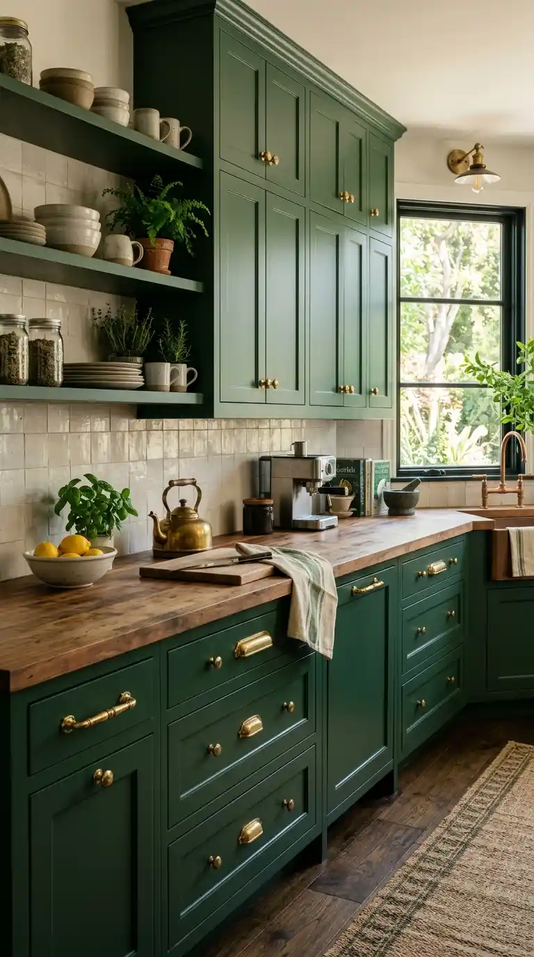
Forest green cabinets bring a deep, rich color that feels both elegant and connected to nature. This darker shade of green works beautifully on a kitchen island or a full wall of cabinetry, creating a striking focal point. Forest green pairs particularly well with brass hardware and white or cream countertops for contrast.
Choosing a matte finish for this color enhances its rich, velvety depth rather than appearing glossy or plastic. Pairing forest green with warm wood open shelving or a butcher block countertop softens the boldness with natural texture. This color choice works well in kitchens with good natural light, allowing the depth of the green to be fully appreciated. Forest green remains a striking yet timeless choice for homeowners wanting drama with sophistication.
Conclusion
Kitchen cabinet color is one of the most impactful design decisions a homeowner can make, shaping the mood and style of the entire room. The ten ideas above show how everything from soft neutrals to bold jewel tones can transform a kitchen’s atmosphere when paired thoughtfully with hardware, countertops, and lighting. There’s no single right choice, only the color that best fits your home’s overall style and your own taste.
Whether you lean toward timeless warm white or a daring forest green, the key is choosing a color that feels cohesive with the rest of your space. Two-tone approaches offer a flexible way to experiment with bolder colors without full commitment. Over time, the right cabinet color becomes the foundation that ties the entire kitchen together. A simple color choice can truly transform how a kitchen feels every single day.